Ichiban Sushi
Colour and character on a plate.
⬥ Visual Identity
⬥ Website
Our pals over at Clui Design brought us on board to help with an ID overhaul for Ichiban Sushi, coinciding with their new store opening at Brisbane’s new West Village development.
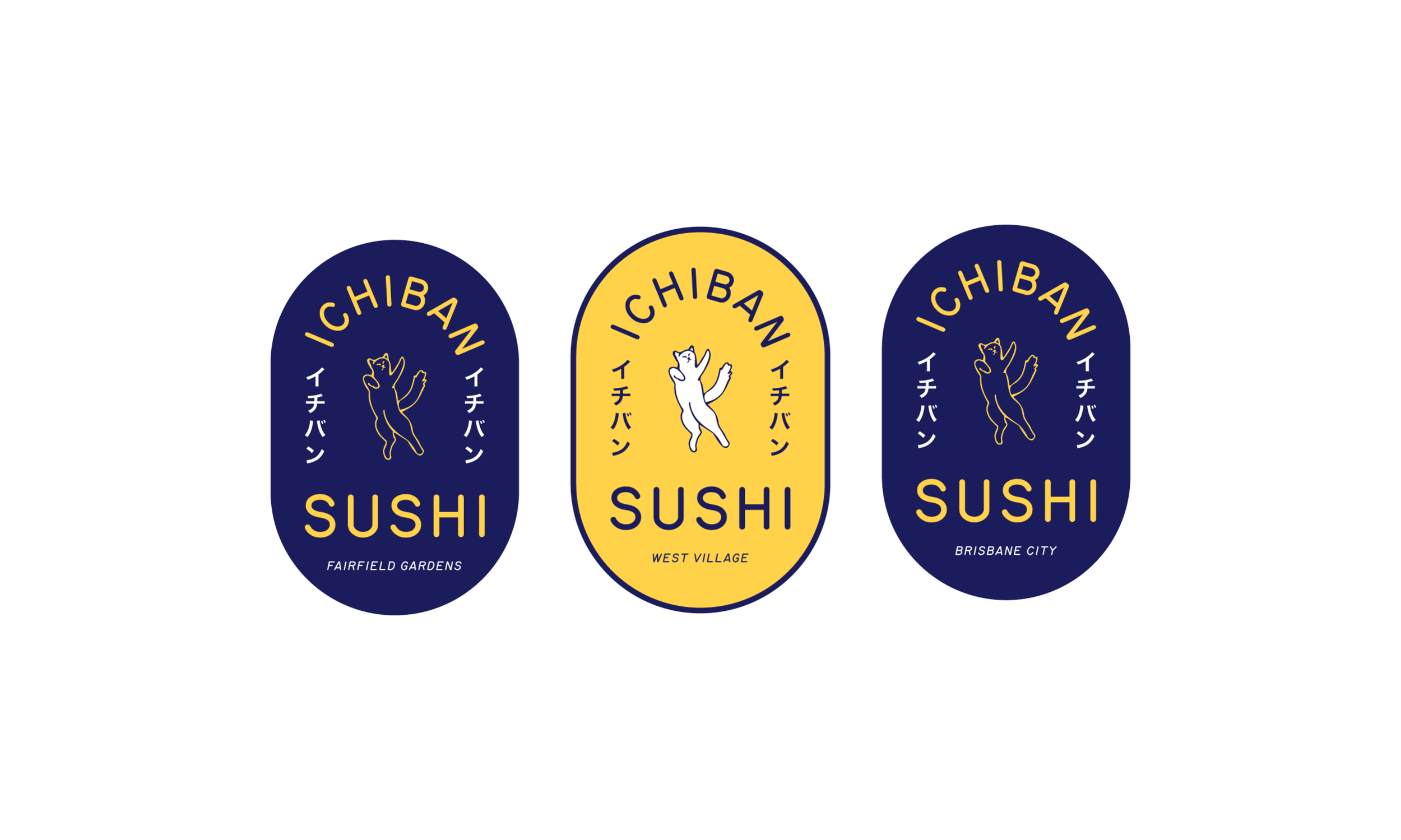
The owners wanted to use this opportunity to add some vibrancy and character that they felt was missing from the current identity. A range of concepts were developed with the intention to capture the fun and approachable attributes of the brand, with the winning idea centred around a mischievous kitten we named Neko Chan.
Read More
Neko Chan is the heart and soul of Ichiban Sushi. She’s relaxed, always hungry and loves to party.
As this is the first Ichiban Sushi store to be licensed, we wanted to imbue the brand ID with the feel of a good-time Izakaya Bar. Colour plays a big role here, steering away from the traditional red, black and white so often associated with Sushi restaurants, and instead opting for an eye-catching combo of yellow and navy as accent colours.
Routed Gothic (A digitisation of the template letters of the Leroy Lettering set) was selected as the brand’s body font for its roots in technical drawings, and is paired with Mathieu David’s New Hollywood - an experimental typeface based on Apfel Grotesk by Collletttivo.
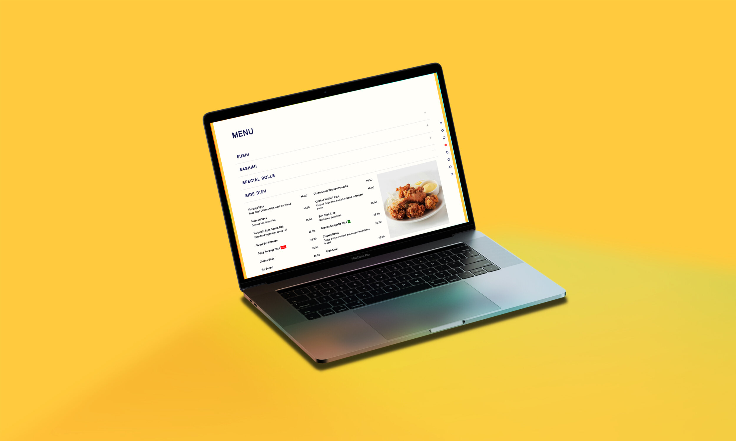
Finally, a single page website was developed, nesting FAQs and Ichiban Sushi’s many menu items under organised accordion sections for ease of navigation and information recall.
You might also like


