Pangram Pangram’s Brave Neue World
We spoke with Pangram Pangram Foundry’s Mat Desjardins about how he’s made type a (successful) career path, his creative process and the upcoming release of his latest work - Neue World.
Tell us about your design background and how you came to start the Pangram Pangram Type Foundry.
So basically, I was a graphic designer for about 10 to 15 years. I've been working in ad agencies for a while and then I started doing some freelance work as well. And at some point, I got into typography. I started reading books about it. Obviously as a graphic designer, you play around with typography a lot, so it was an interest to me.
When I got to reading different books about it, I just decided to start creating one and see where it would go, and that was around 2015. I created my first font and just started distributing it on Behance for free. People really seemed to like the font, so I decided to create another one, and another one, and then one became five, and then I decided to just create a small website for it.
I had some programming background. Way, way back, I used to do some action script with Flash, so I have a bit of experience with coding. So I just created my own website, just showcasing and giving the typefaces for free at that time. And then eventually, I just started to think about it in more like a business way. I decided to just tell people that if they want the font for a commercial project, just buy the license, while still giving the fonts for free. So that is what became my main business model with the Foundry.
What does each stage of the process involve and how do you approach it?
Photo: Mat Desjardins (supplied).
Personally, I like to create fonts that I would want to use, and I also like to create fonts that could be used in a wide array of contexts. So obviously I like the nice, funky display fonts, but when I'm creating one I just want to make it as complete as possible. So it usually starts with... Obviously, like all of us, I look up to lots of inspiration on the daily. So I get a lot of... It's more of a feeling, I'd say, of a trend.
Sometimes there's a trend pattern emerging from all the references I see. And I'm like, "Oh yeah, maybe a font like this could work right now in the industry." I start thinking about different shapes and letters, and sometimes I gather specific pieces of references. But most of the time, I just have ideas of shapes and letters, and I start drawing them directly, and usually from different shapes, other glyphs or symbols or letters emerge. And I go from letter to letter, from shapes to shapes, to just creating the whole font.
Does your work begin from hand or is your process 100% digital?
I do everything digitally. I'm actually a very... I suck at drawing. I've only worked digitally all my life, so it just makes sense to just draw letters and shapes in the software directly. And for me, it's easier to just change the shape or try stuff out. It's super convenient for me and it's easier, I think.
How much time do you allow for revisions?
I mean, I don't have a set schedule when I create a typeface. I go with the inspiration. Obviously it's separated in, I'd say, four different stages.
The first one being just trying out some shapes and some letters. The second one is drawing out all their characters, the symbols of every weight. And then the third one would be spacing, kerning, and just overall testing. And then the last one would be just trying it out in real life designs and adjusting the font accordingly to see if there's problems with it or issues. I correct them at that stage.
Depending on the font, and depending on how big the family is, a typical font will take me about, I don't know, three to six months. The way I approach things is that I correct the font until the point I feel it's professional enough to put it up there and see what people do with it, what comes out of it.
Yeah, that's it, basically. I don't want to spend like three years on a font, because it's obviously possible, there are so many details. But I don't want to spend three years on a font and then people won't use it. I want to have some feedback at some point. When I feel that font is great, or great enough, I just publish it and see. And then I go back to it as time goes to make it evolve, and create some new versions. Or some things that I like maybe in the past, I think needs to be refreshed in a font.
Where does Neue World draw a lot of its inspiration from?
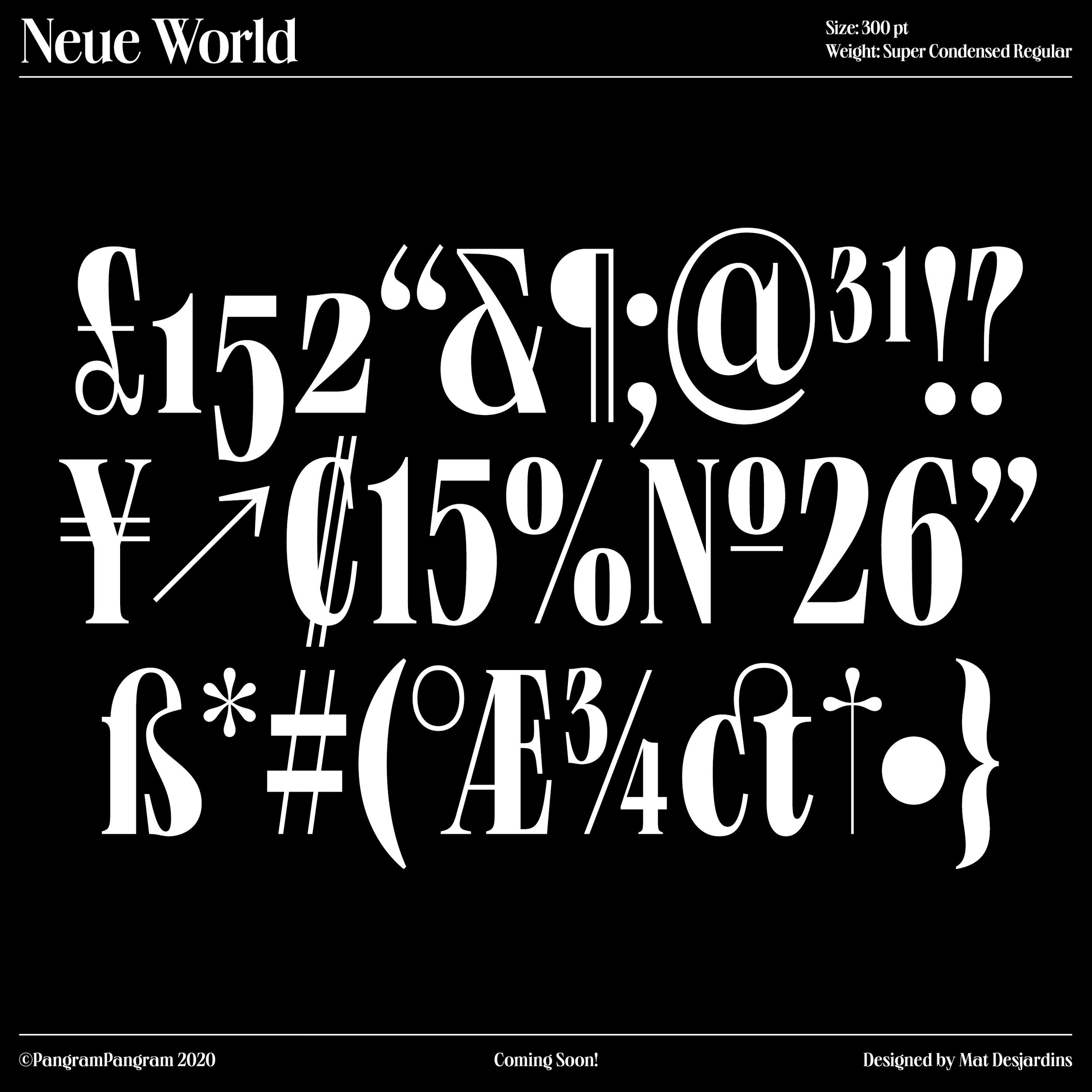
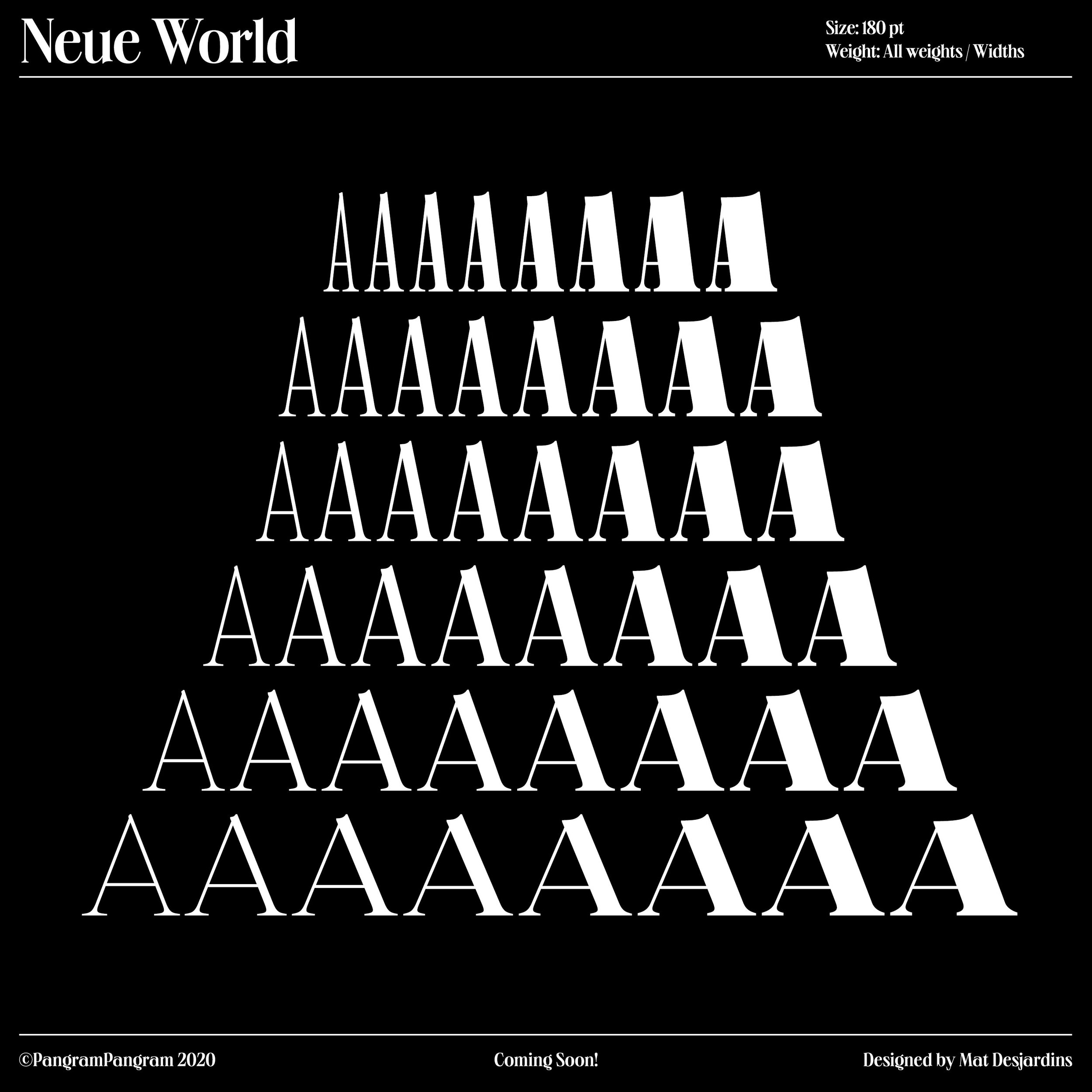
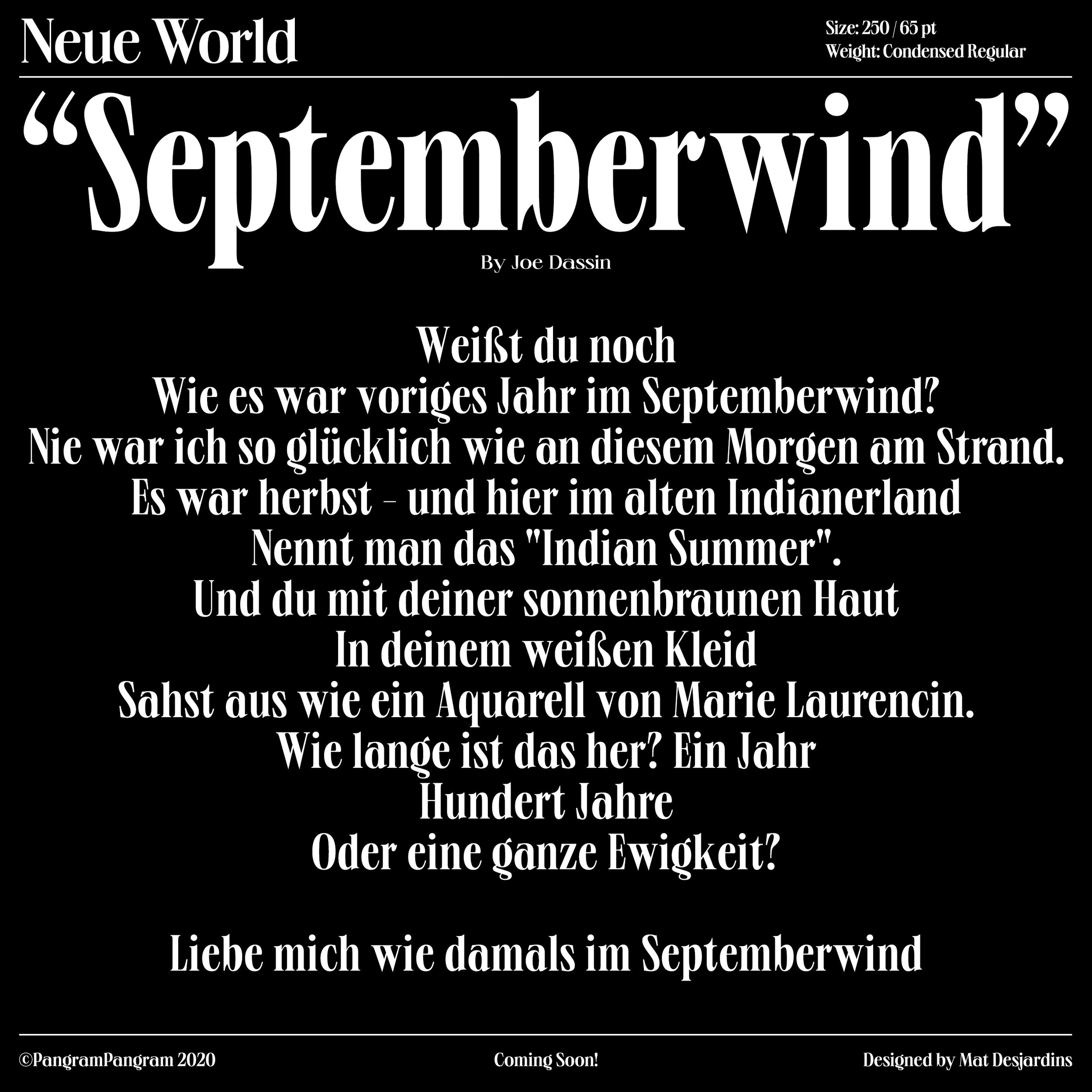
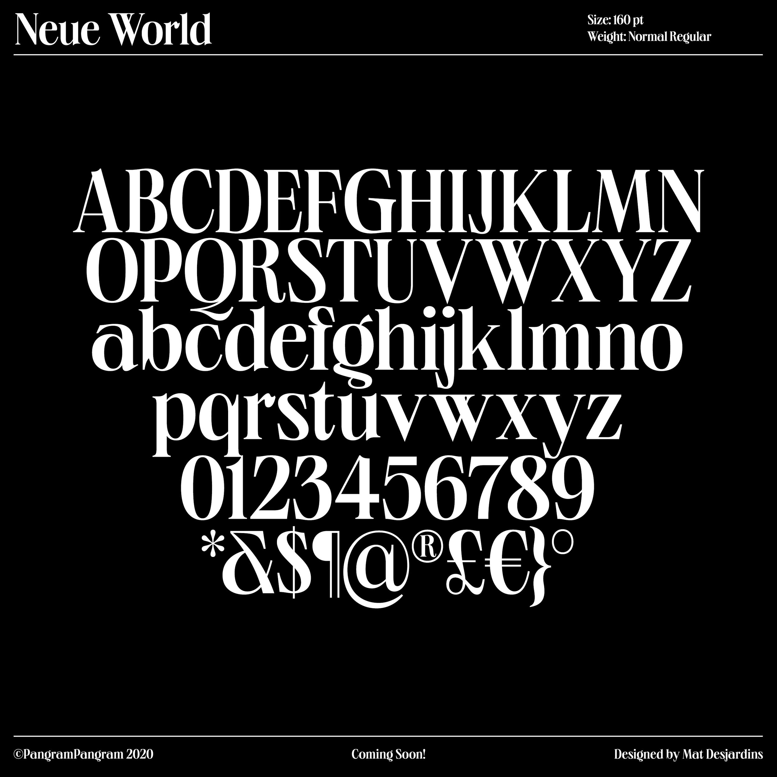
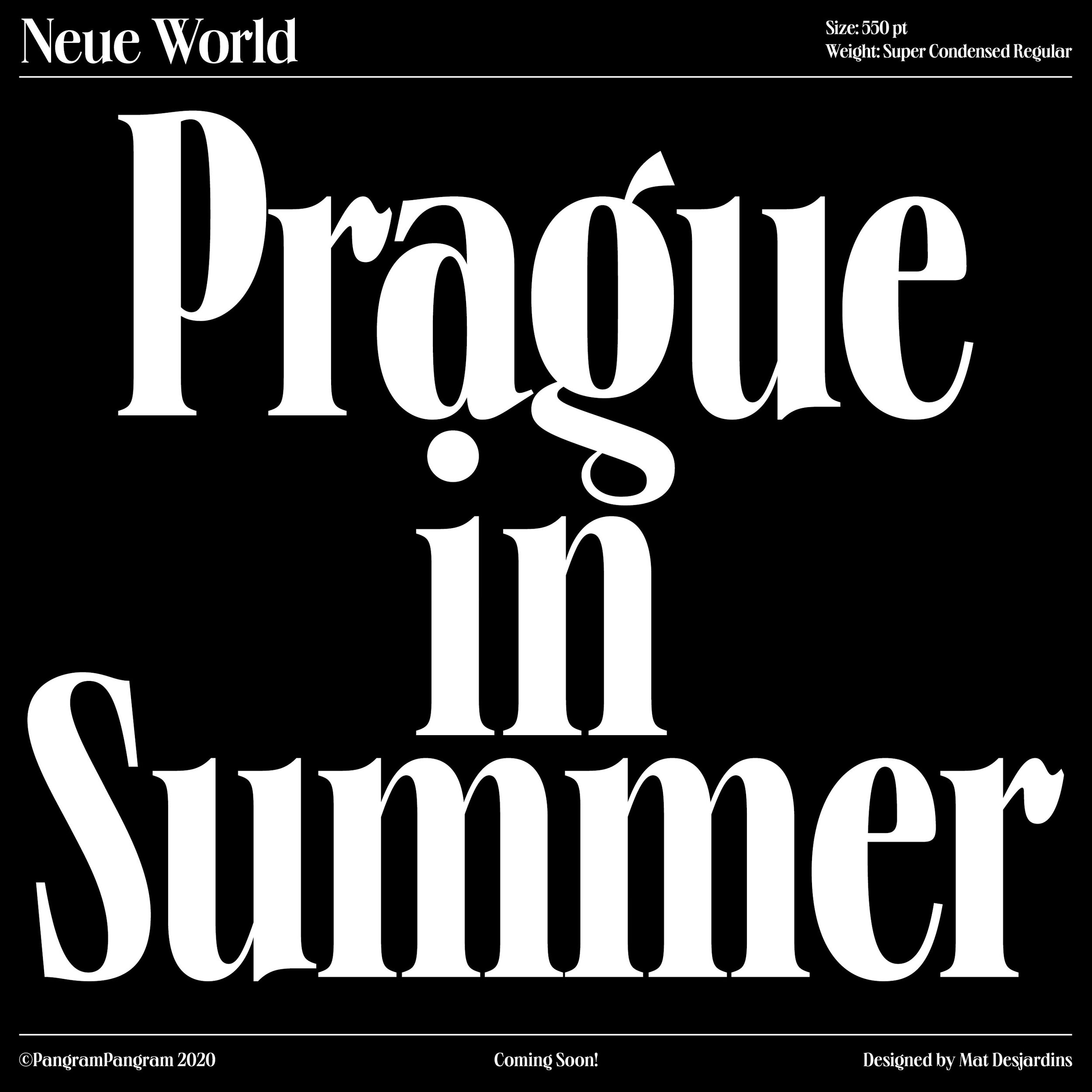
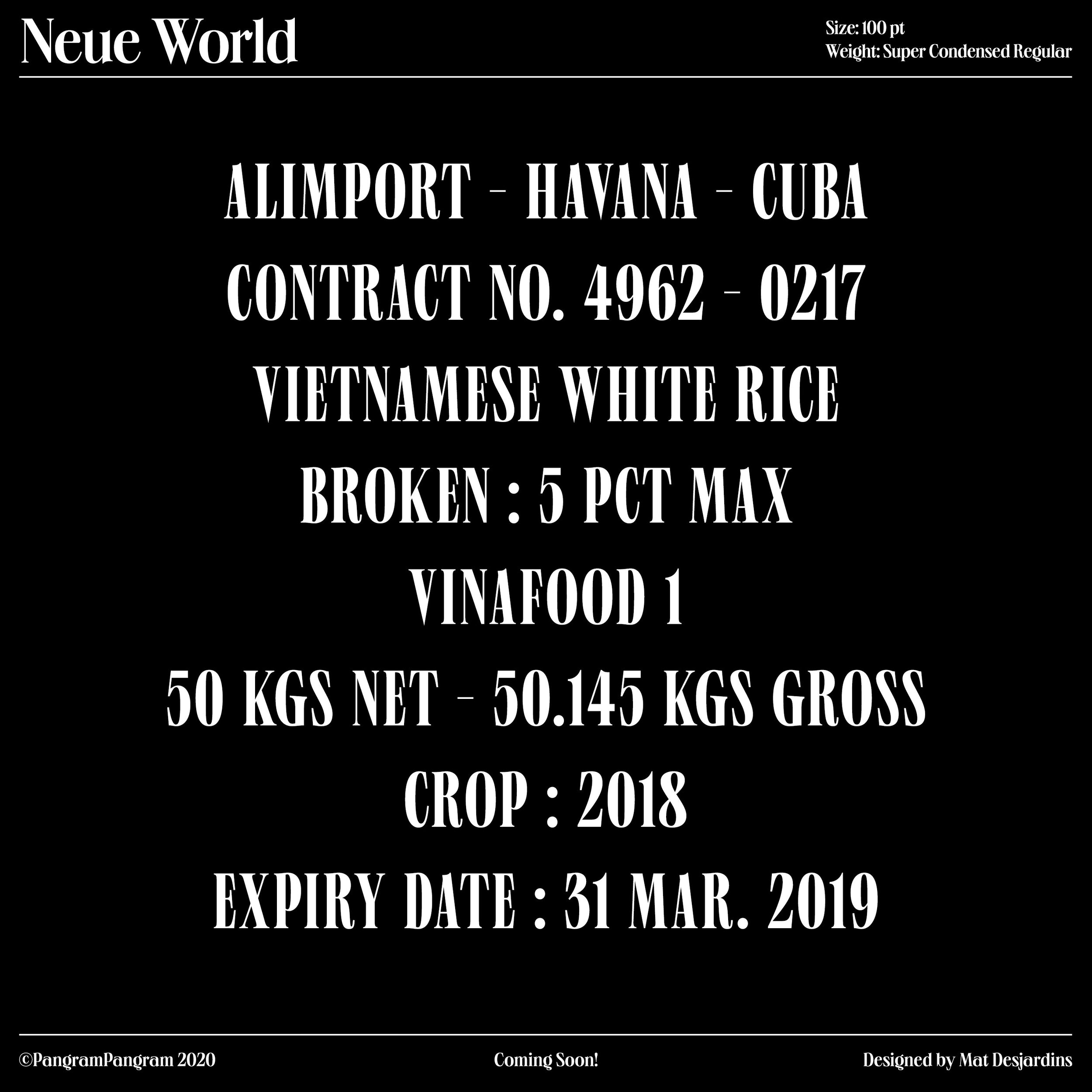
That specific font came from a super old poster, I think it's a German opera? And what I like about this specific poster is that German words, they can be super long. So the way they did it, since they have a finite space on the poster, is that they just squeezed the super long word to make them fit. So the same font has a bunch of different widths.
So I was like, "Oh, that's a good idea." Especially in this context, but specifically when you have super long words and you want to make them fit, so it, graphically, it gives a nice feel.
At the same time, it makes the font super versatile and useful. And especially, I think, in these times with all the mobile apps and websites and stuff like that, you need sometimes to put a lot of information in a super tight space. So having a more condensed font is super interesting, but at the same time, the same font can provide you with a nice, wide, bold title, for example.
So that was kind of the idea, or the inspiration for it. I thought it would be nice to create a font with multiple widths for that purpose.
The new typeface previews suggest this will be a variable font. Is this true?
These days, every new font that I release will be variable. I think it's just an extra asset to have when you're using the font. Right now it's still in beta, but in terms of publishing it, it's fairly easy, in a sense that the software allows you to export it. When you create a font, you usually create the end points of a spectrum, basically.
So for this one, for example, I'm creating the super thin, super narrow, and then the super wide and super bold, and probably some widths in between those. But the software can sort of extrapolate the in-between. In that sense, it's super easy for the software to just create a variable font from that. It's a no-brainer to just export the variable font, as well as the regular, specific determined weights. Of course, there's some tweaks to be done, because again, it's still in beta and some bugs occur.
But overall, it's very easy. So of course, I'm going to create a variable font out of it. But on top of that, it makes a lot of sense within the concept that I just mentioned, to have the possibility to just have the specific width or the specific weight that you can choose from the variable font to fit your design. I think that's going to be a big plus you when you're using this font.
How difficult do you find it to settle on a name for a typeface?
That really depends. Sometimes I know exactly what I want the font to be named, like Neue Montreal. I'm from Montreal, and the inspiration was from the design in Montreal in the '60s and '70s, so it made sense. And I wanted to create a font that's sort of an homage to that, so that was easy.
Or like Formula Condensed. I wanted to create a font that's like a condensed, sporty sort of typeface, or like a more display bold-ish typeface. Formula, I guess it came from the Formula One race car, and I guess I envisioned having a sponsor on a Formula One racing car using this font, or whatever.
Usually they come up by themselves, but for this one, the Neue World, I'm still not sure about it. At some point, I guess it's just going to pop in my head. I'll be like, "Oh yeah, that makes sense." I think it's a mix of things. Sometimes it makes sense, sometimes it's just I need to find something. But I usually wait for it. I don't force a name onto a typeface. Usually it comes up, or when I start creating designs with it, maybe it's going to come up. It's like that.
Do you have a date that we can expect to see this released?
I mean, I'm doing a lot of things these days, so I'm aiming at, I'd say, a couple of months. So we're May, so June, July... Yeah, sometime this summer, hopefully.
How has Pangram Pangram ultimately changed your life?
Well, it completely changed my life. Like I said, I used to work for agencies, I used to freelance. And since 2018, I've been doing that (Pangram Pangram) full time. I've got no plans on going back to doing anything else. It's going well. It's growing a lot. I have a lot of new collaborators and new typeface designers who are submitting fonts. I have a lot of new stuff coming, not only typefaces.
Through Pangram, I'm designing T-shirts with Everpress, I'm designing iPhone cases with Casetify. I touch on a lot of other things, so it's keeping me busy. So yeah, it changed my life a lot, I'd say.
What’s been your proudest moment or achievement with Pangram Pangram to date?
Honestly, there's a lot of them. I always get really, really humbled and proud when I see people using my typefaces in real life contexts, or big clients like Facebook. They have this conference every year about the Oculus Rift, the VR headset. And they have this conference every year, and last year they used Monument Extended for the whole campaign, the whole branding.
It was on the building, it was part of the logo and all their communication. So it was super nice. Also Harley Davidson has recently rebranded themselves, and they used Monument Extended for their main logo. That's also pretty huge.
BBC use my fonts, Apple use my fonts. There's a couple of super big clients that, when you see the end result in real life, it's kind of crazy. When you were not so long ago just drawing those letters on the computer, and then people actually use them to convey a message and create emotion with them. I think it's one of the best feelings.
And I mean, just the fact that Pangram Pangram is working. I think it's a big achievement. I think it's the culmination of all my experience in working in the agencies and in marketing and design. It's a bunch of different things coming together, and the fact that it's working, it's just making me so proud. I keep getting new ideas and being super motivated to push further.
UPDATE: Neue World is
here! Now available to try and purchase from Pangram Pangram
All Pangram Pangram fonts are free for designers to try, however, you can support the Foundry by purchasing the 2019 Designer Font Starter Pack (featuring the likes of Formula Condensed and Monument Extended in a range of weights) for just USD$25.00.
pangrampangram.com
Pangram Pangram on Instagram
Pangram Pangram on Behance


